Marketing consultants always amuse me when they say that the path to riches for a company is a “brand refresh.” Yes, that’s right; let’s not look at your products or your services or your operating expenses compared to profit margin. What needs to happen is a total re-design of your logo and your type font. Change that and consumers will flock to your business.
Rubbish. No one cares about your new logo if they still have to wait on hold for 30 minutes to get an answer to their question.
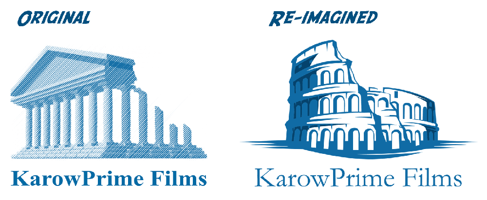
That being said, I can proudly say that it was time to give the KarowPrime Films logo a refreshed look. The first logo was designed by my loyal boyhood friend, Alan. I recall telling him that “I liked ancient Rome.” To me, their emperors were strong proud men, but what was most appealing was their longevity; we still talk about them today.
So, Alan dutifully created the first KarowPrime Films logo and I loved it. It was on my business cards, my stationery, my invoices, my web sites, my video productions – it was all over the place. He even created a few animations of the logo.
After 30 years, I felt it was time for a change. I still enjoyed the crumbling yet sturdy Romanic structure but the fine detail of the image did not work for web and new media. At the time that Alan created the logo, those communication forms did not exist.
Not to bother Alan for a re-imagination of the KarowPrime Films logo because he is now a husband and father, I embraced the new way of doing things; I found a supplier online whom I did not know who worked in India at KreativeShudezi.
They created a wonderful new logo that embraced the timeless strength of ancient Roman – a birthplace of Western story-telling – and crafted a bold new look. It was wonderful work!
For the next 30-odd years, we have a new logo for KarowPrime Films.
